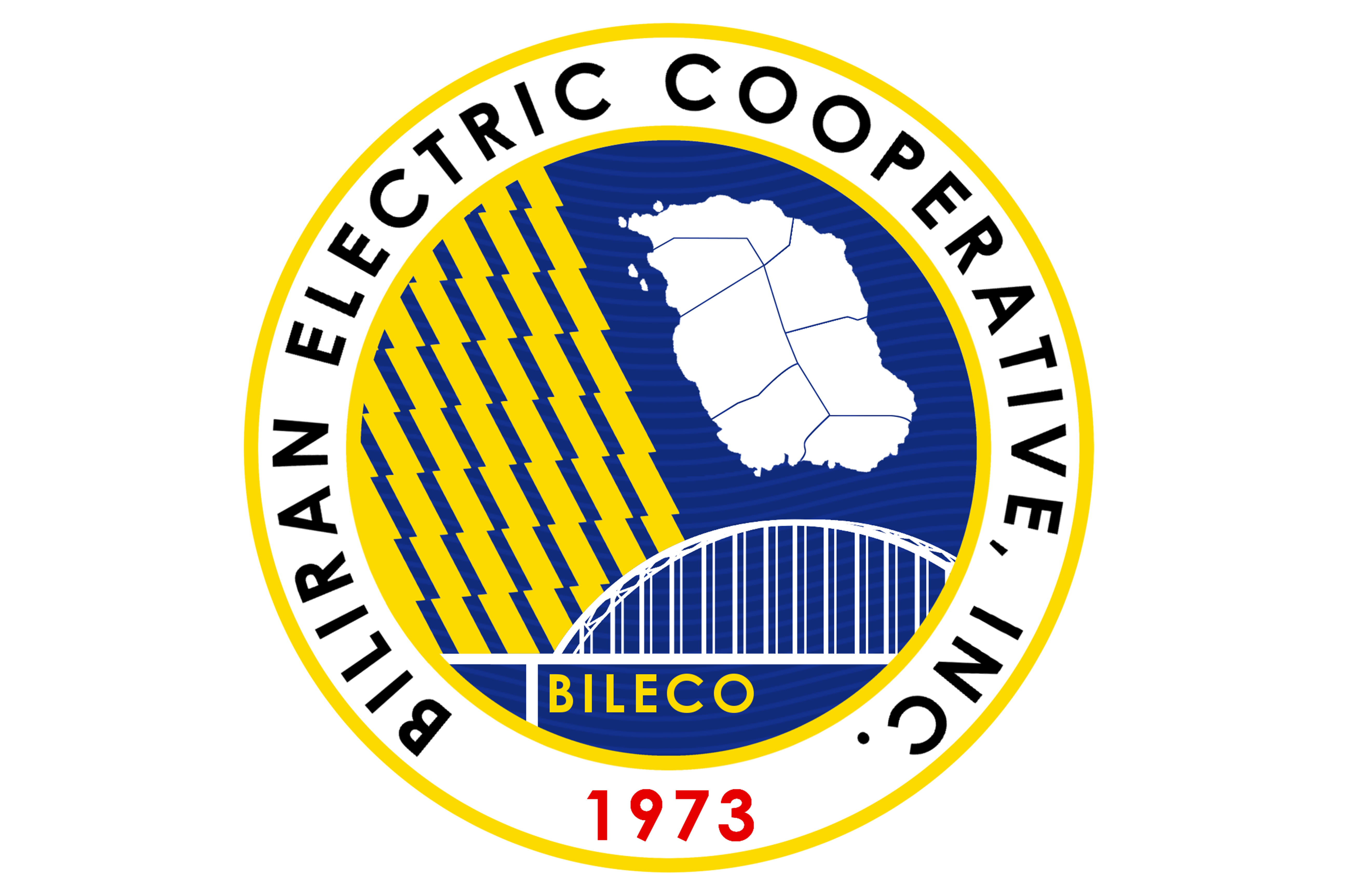
After barely two months since holding the contest, the Board of Directors had finally chosen and approved BILECO’s new logo design on October 21, 2017 during the regular Board meeting.
The new logo, designed by Engr. Jasper Bagdoc, highlights the lightning bolts which symbolize BILECO’s pursuit to rural electrification within its area coverage. The seven bolts represent its seven corporate values.
The logo also depicts the map of Biliran representing its franchise area and the Biliran bridge which serves an iconic landmark of the province. The placement of ‘BILECO’ under the bridge signifies BILECO’s role in building the foundation of a developed and progressive Biliran province through the provision of a reliable and efficient electric service.
The new logo also retains its official colors blue and yellow.
A total of 20 entries were submitted throughout the contest period.


